ONNA
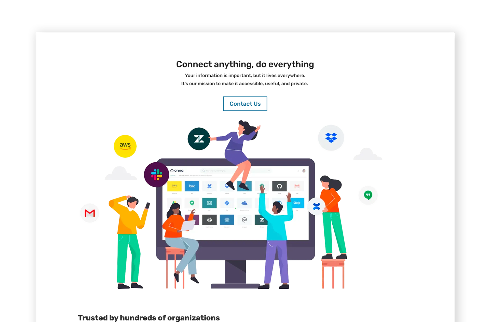
Onna provides a platform that pulls data from apps and puts it all in one place so that searching and managing can be done more quickly and easily. I was given two projects: a marketing project to create a one-pager that encourages users to learn more about what Onna does and a website hero redesign to improve the brand and user experience.
Role Visual Designer - onna.com
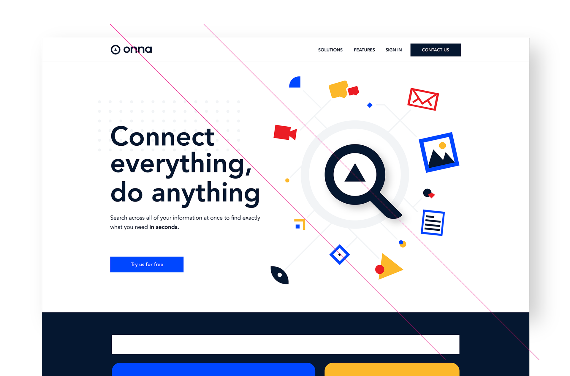
I created shapes that symbolize the ONNA brand and put them together in a manner that produces a visual narrative that users can simply follow for the one-pager. Making a better visual flow is essential for getting viewers where you want them to go.
Onna used a generic design for their homepage hero, which resulted in low engagement. To boost the experience, I came up with a couple of interactive solutions, that provided a better visual hierarchy for greater user experience and engagement. Shapes created, are responsive and interact with users when the mouse cursor is on them. A more playful approach increased the user's visibility and eagerness to participate.


